Annotation Properties
Administrator can define the look of drafting objects by setting up Annotation Property Defaults in the library or project database. New annotations that are added to a drawing use the default annotation properties, but designers can override the defaults by picking properties from another drafting object or by editing property values manually.
Labels work differently than other drafting objects in that they can get their properties from the 2D symbol, from the labeling style, or from annotation properties, as described in Label Properties.
Some annotation properties can inherit a style that is defined in Layer configuration, Drawing styles, or Lineweights, so those configurations must be set up first so that they can be used in annotation properties.
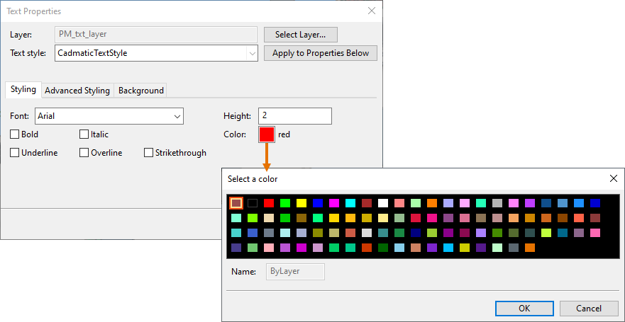
The color property of an annotation type can be selected from the configurable CADMATIC color palette (see Colors) or inherited from the color of the layer; the layer configuration supports 255 DWG colors. In the color selection dialog, the first color is always the color that the drafting object can inherit from the layer.
The properties that the administrator and/or the designer can set for drafting objects are:
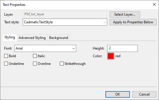
Text Properties
You can define the following properties for drafting texts.
-
Layer – Click Select Layer to specify which layer in Layer configuration to use for text. Texts can inherit their color, text box color, and text box lineweight from the layer, as described below.
-
Text style – Text style defines the general visual appearance of the text. The default text style is "CadmaticTextStyle". You can select a different text style that has been defined in Drawing styles and then click Apply to Properties Below to apply the style to the relevant properties.
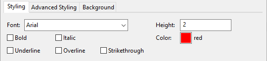
Styling
On the Styling tab, you can define the following properties for text.
-
Font – Select the Microsoft Windows font to use.
Note: Make sure the font you select contains all the necessary characters. If drawing text contains characters that are not represented in the selected font, the program substitutes the font used for that specific character with another font, and the results of this automatic substitution may vary.
-
Bold, Italic, Underline, Overline, Strikethrough – Select whether to apply these styles to the text.
-
Height – Specify the height of the text bounding box.
-
Color – Click the colored box to select the color to use for text and text border (if set to be shown). The first color in the color selector is the DWG color that is inherited from the layer.
Advanced Styling
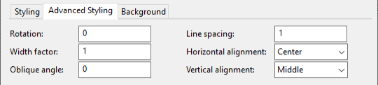
On the Advanced Styling tab, you can define the following properties for text.
-
Rotation – Specify the rotation of the text as a positive or negative value. The rotation value of normal, horizontal, left-to-right text is 0, and entering a positive value rotates the text counter-clockwise.
-
Width factor – Specify the width factor of the text. Value 1 means normal text, values smaller than 1 make the text narrower, and values larger than 1 make the text wider, while the height of the text always remains the same.
-
Oblique angle – Specify the slant angle of the text by entering a value between
-
Line spacing – Specify how much spacing to add between lines of text by entering a value between 0.25 and 4.
-
Horizontal alignment – Select how to align the text horizontally: Left, Center, Right.
-
Vertical alignment – Select how to align the text vertically: Top, Middle, Bottom.
Background
On the Background tab, you can define the following properties for text.
-
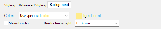
Color – Select whether to apply a background color to text boxes:
-
No fill – Do not apply background color to text boxes.
-
Use background color – Use the general background color also in text boxes. This allows a text box to have, for example, black background in the document editor and white background in the generated document.
-
Use specified color – Click the colored box to select the color to use for the background. The first color in the color selector is the DWG color that is inherited from the layer.
-
-
Show border – Select this option to add a border around the text box, in the same color as the text.
-
Border lineweight – Set the border lineweight to be inherited from the text layer or select a lineweight defined in Lineweights.
Line Properties
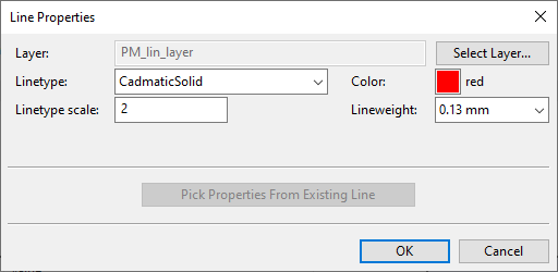
You can define the following properties for lines and rectangles. If you are editing the properties in an open document, you can pick the properties from an existing line.
-
Layer – Click Select Layer to specify which layer in Layer configuration to use for polylines. Polylines can inherit their linetype, color, and lineweight from the layer, as described below.
-
Linetype – Set the linetype to be inherited from the layer or select a linetype defined in Drawing styles.
-
Linetype scale – Specify a scaling value for the pattern of a dashed line.
-
Color – Click the colored box to select the color to use for polylines. The first color in the color selector is the DWG color that is inherited from the layer.
-
Lineweight – Set the lineweight to be inherited from the layer or select a lineweight defined in Lineweights.
Multiline Properties
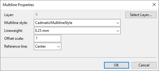
You can define the following properties for multilines.
-
Layer – Click Select Layer to specify which layer in Layer configuration to use for multilines. Multilines can inherit their colors and lineweight from the layer.
-
Multiline style – Select a multiline style defined in Drawing styles.
-
Lineweight – Set the lineweight to be inherited from the layer or select a lineweight defined in Lineweights.
-
Offset scale – Define a scaling value for offsetting the lines of the multiline style. In a multiline style, each separate line has an offset value that determines its distance from the reference line, and the scaling value can be used to adjust the offsets. For example, offset scale 2 doubles the original offset values, scale 1 uses the original offset values, scale 0 removes all offsets, and scale -1 uses the original offset values but mirrors the positions.
-
Reference line – Select whether multilines are placed at the top, center, or bottom of the line that the user draws.
Arc Properties
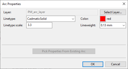
You can define the following properties for arcs. If you are editing the properties in an open document, you can pick the properties from an existing arc.
-
Layer – Click Select Layer to specify which layer in Layer configuration to use for arcs. Arcs can inherit their linetype, color, and lineweight from the layer, as described below.
-
Linetype – Set the linetype to be inherited from the layer or select a linetype defined in Drawing styles.
-
Linetype scale – Specify a scaling value for the pattern of a dashed line.
-
Color – Click the colored box to select the color to use for arcs. The first color in the color selector is the DWG color that is inherited from the layer.
-
Lineweight – Set the lineweight to be inherited from the layer or select a lineweight defined in Lineweights.
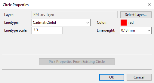
Circle Properties
You can define the following properties for circles. If you are editing the properties in an open document, you can pick the properties from an existing circle.
-
Layer – Click Select Layer to specify which layer in Layer configuration to use for circles. Circles can inherit their linetype, color, and lineweight from the layer, as described below.
-
Linetype – Set the linetype to be inherited from the layer or select a linetype defined in Drawing styles.
-
Linetype scale – Specify a scaling value for the pattern of a dashed line.
-
Color – Click the colored box to select the color to use for circles. The first color in the color selector is the DWG color that is inherited from the layer.
-
Lineweight – Set the lineweight to be inherited from the layer or select a lineweight defined in Lineweights.
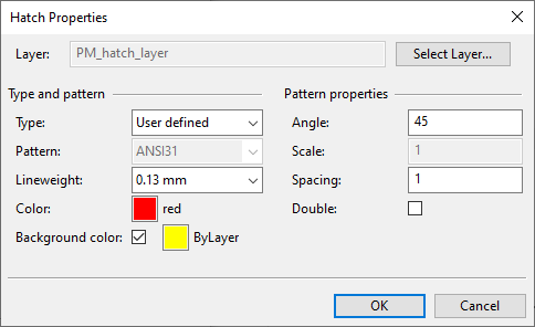
Hatch Properties
You can define the following properties for hatch patterns.
-
Layer – Click Select Layer to specify which layer in Layer configuration to use for hatches. Hatches can inherit their lineweight, color, and background color from the layer, as described below.
Type and pattern
-
Type – Select the hatch type:
-
Predefined – If selected, the hatch pattern to use is selected from the Pattern field.
-
User defined – If selected, the hatch pattern is created with straight lines and properties in the Pattern properties section.
-
-
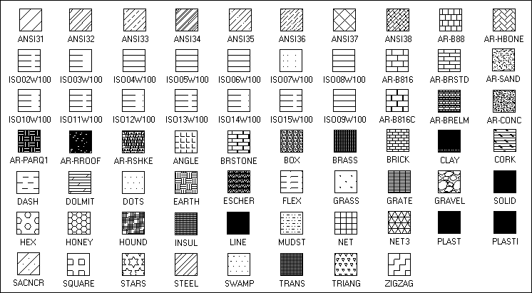
Pattern – Select a predefined pattern type from the list. Refer to the image below for possible hatch patterns that can be used.
-
Lineweight – Set the pattern lineweight to be inherited from the layer or select a lineweight defined in Lineweights.
-
Color – Click the colored box to select the color to use for hatches. The first color in the color selector is the DWG color that is inherited from the layer.
-
Background color – Select this option to use a background color in hatches and click the colored box to select the color.
Pattern properties
-
Angle – Specify the angle of the hatch pattern as a positive or negative value; 0 means horizontal lines.
-
Scale – Specify a scaling value to make a predefined hatch pattern larger or smaller.
-
Spacing – Specify the amount of space to add between the lines of a user-defined hatch pattern.
-
Double – If selected, the lines of a user-defined hatch pattern are drawn also in reverse direction.
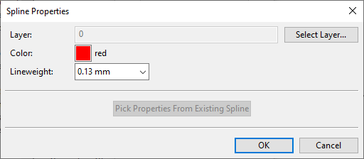
Spline Properties
You can define the following properties for spline curves. If you are editing the properties in an open document, you can pick the properties from an existing spline.
-
Layer – Click Select Layer to specify which layer in Layer configuration to use for splines. Splines can inherit their color and lineweight from the layer, as described below.
-
Color – Click the colored box to select the color to use for splines. The first color in the color selector is the DWG color that is inherited from the layer.
-
Lineweight – Set the lineweight to be inherited from the layer or select a lineweight defined in Lineweights.
Dimension Properties
You can define the following properties for dimensions.
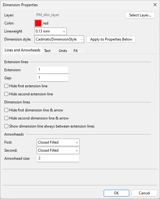
-
Layer – Click Select Layer to specify which layer in Layer configuration to use for dimensions. Dimensions can inherit their color and lineweight from the layer, as described below.
-
Color – Click the colored box to select the color to use for dimensions. The first color in the color selector is the DWG color that is inherited from the layer.
-
Lineweight – Set the lineweight to be inherited from the layer or select a lineweight defined in Lineweights.
-
Dimension style – The default dimension style is Cadmatic-DimensionStyle. You can select a different dimension style and then click Apply to Properties Below to apply the style to the relevant properties.
For information on how to define dimension styles, see Drawing styles.
On the Lines and Arrowheads tab, you can define the following properties for dimensions.
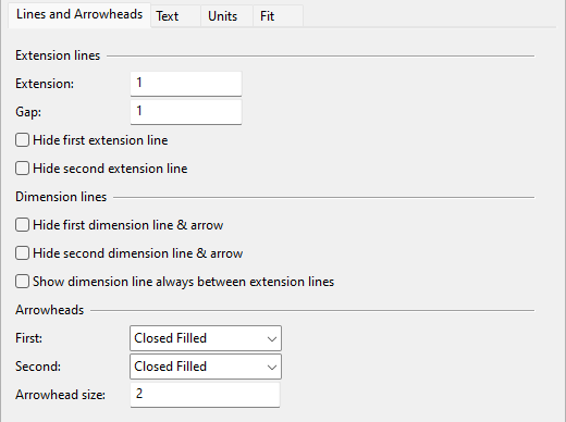
Extension lines
-
Extension – Specify how much extra length to add to extension lines.
-
Gap – Specify how much space to add between the reference point and the extension line.
-
Hide first extension line – Select this option to hide the first extension line.
-
Hide second extension line – Select this option to hide the second extension line.
Dimension lines
-
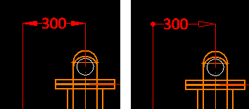
Hide first dimension line & arrow – Select this option to hide the first dimension line and its arrowhead.
-
Hide second dimension line & arrow – Select this option to hide the second dimension line and its arrowhead.
-
Show dimension line always between extension lines – Select this option to show the dimension line even when the arrowheads do not fit between the extension lines.
Arrowheads
-
First, Second – Select a suitable arrowhead style for each end of the dimension line, or "None" to omit the arrowhead.
-
Arrowhead size – Specify the overall size of the arrowheads.
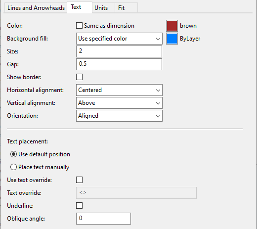
On the Text tab, you can define the following properties for dimensions.
-
Color – Select Same as dimension if you want dimension text to use the color that is selected in the general dimension properties. Otherwise, clear the option and click the colored box to select the color to use for dimension text. The first color in the color selector is the DWG color that is inherited from the layer.
-
Background fill – Specify whether to use a background color to hide any 3D or 2D lines that are inside the bounding box of the dimension text, except 2D lines that are drawn on top of the dimension text.
-
No fill – Use a transparent background for dimension text.
-
Use background color – Use the background color of the application as the background color of dimension text.
-
Use specified color – Click the colored box to select the color to use for the background. The first color in the color selector is the DWG color that is inherited from the layer.
-
-
Size – Specify the size of the dimension text.
-
Gap – Specify how much space to add around the dimension text.
-
Show border – If gap is defined, select this option to add a border around the text, in the same color as the dimension lines.
-
Horizontal alignment – Select how to horizontally align the text in regard to the dimension line: Centered, By the first/second extension line, Over the first/second extension line.
-
Vertical alignment – Select how to vertically align the text in regard to the dimension line: Centered, Above, Outside, Below.
-
Orientation – Select the orientation of the dimension text:
-
Aligned – Select this option to align the text with the dimension line.
-
Horizontal – Select this option to align the text horizontally.
-
Custom angle – Select this option and enter the angle value to set the text to a specific angle.
Note: Vertical dimensions are affected by both this setting and the "Dimension text attachment to the dimension" setting on the Fit tab.
-
-
Text placement – Select how to place the text:
-
Use default position – The program decides where to place the text.
-
Place text manually – You can place the text manually.
-
-
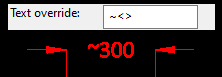
Use text override – Select this option to define an override text in the Text override field.
-
Text override – In this field, the angle brackets "<>" represent the normal dimension value.
If you remove the brackets, the text you type replaces the dimension value.
If you leave the brackets, the text you type before or after the brackets is shown in addition to the dimension value.
Note: This can be used instead of or in addition to the actual prefix and suffix defined on the Units tab. Prefix and suffix are closer to the dimension value.
-
Underline – Select this option to underline the dimension text.
-
Oblique angle – Specify the slant angle of the text by entering a value between
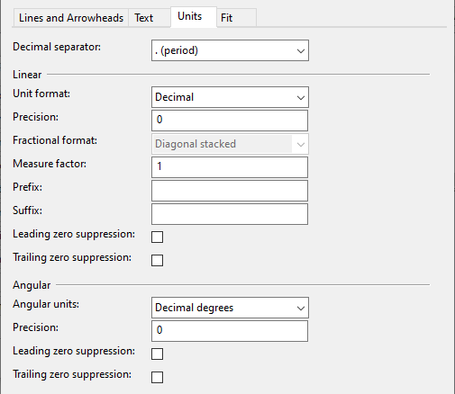
On the Units tab, you can define the following properties for dimensions.
-
Decimal separator – Select whether to use the period or the comma as the decimal separator character.
Linear
-
Unit format – Select a unit of measurement for linear dimensions: Scientific, Decimal, Engineering (inches), Architectural (inches), Fraction.
-
Precision – Select a display precision (number of decimals) for linear dimensions. Depending on the unit format, either enter a value between 0 and 8 or select the precision from the list.
-
Fractional format – Select a fractional format for Architectural or Fraction units: Diagonal stacked, Horizontal stacked, Not stacked.
-
Measure factor – You can set linear dimensions to be counted by a factor. To convert millimeters (the basic CADMATIC unit of measure) to inches, set the factor to 0,03937.
-
Prefix – Specify the characters to be inserted before linear dimensions.
-
Suffix – Specify the characters to be inserted after linear dimensions.
-
Leading zero suppression – Select this option to remove leading zeros from linear dimension values.
-
Trailing zero suppression – Select this option to remove trailing zeros from linear dimension values.
Angular
-
Angular units – Select a unit of measurement for angular dimensions.
-
Precision – Select a display precision for angular dimensions. Enter a value between 0 and 8 or select the precision from the list.
-
Leading zero suppression – Select this option to remove leading zeros from angular dimensions.
-
Trailing zero suppression – Select this option to remove trailing zeros from angular dimensions.
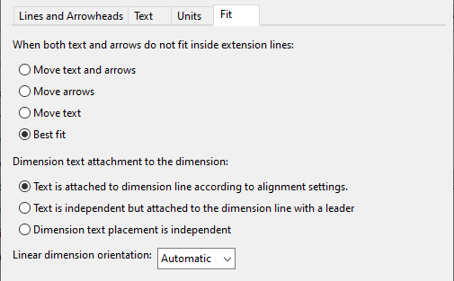
On the Fit tab, you can define the following properties for dimensions.
-
When both text and arrows do not fit inside extension lines – Select what to move first outside the extension lines if the dimension text, the dimension line, and the arrowhead symbols do not all fit inside the lines.
-
Move text and arrows – Move both the text and the arrows outside.
-
Move arrows – Move just the arrows outside.
-
Move text – Move just the text outside.
-
Best fit – The program decides what to move.
-
-
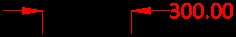
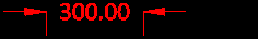
Dimension text attachment to the dimension – Select a placement method for the dimension text. The effect of these settings depends on how Orientation is set on the Text tab—in the examples below, it is set to "Horizontal".
-
Text is attached to dimension line according to alignment settings
-
Text is independent but attached to the dimension line with a leader
-
Dimension text placement is independent
-
-
Linear dimension orientation – Select how to position linear dimensions: Automatic, Horizontal, Vertical, Aligned.
"Automatic" chooses the position based on the start and end points and on where the user drags the dimension line.
Note: This setting only applies to new dimensions, not to existing ones.

Revision Cloud Properties
You can define the following properties for revision clouds.

-
Layer – Click Select Layer to specify which layer in Layer configuration to use for revision clouds. Revision clouds can inherit their color and lineweight from the layer, as described below.
Text properties
-
Text style – Text style defines the general visual appearance of the text. The default text style is "CadmaticTextStyle". You can select a different text style that has been defined in Drawing styles.
-
Color – Click the colored box to select the color to use for revision cloud texts. The first color in the color selector is the DWG color that is inherited from the layer.
-
Height – Specify the height of the text bounding box.
Line properties
-
Lineweight – Set the lineweight to be inherited from the layer or select a lineweight defined in Lineweights.
-
Color – Click the colored box to select the color to use for revision cloud lines. The first color in the color selector is the DWG color that is inherited from the layer.
-
Arc segment length – Specify the length of the segments that form the arc shapes of the revision cloud.
Label Properties
Labels do not have the same kind of "annotation property defaults" that other drafting objects have. Instead, each individual property of a label can be defined in a number of ways.
-
2D Symbols define the basic look of a label as a composition of text and lines. The 2D symbol can also define visual properties, such as color and lineweight. Those properties that are part of the symbol definition are used in drawings if nothing else overrides the style.
-
Label Definitions combine the 2D symbol with a data request that allows the program to extract information from the target object and show it as the label text. A label definition does not define any visual properties.
-
Labeling Styles bring together a number of label definitions, such as labels for piping or labels for supports, to define their visual properties.
A labeling style has "style defaults" for the label definitions, and the style default of each property can be set to:
-
"Style defaults" – The property uses the style default value if nothing else overrides it.
-
"Drawing defaults" – The value of the property is defined in the drawing.
Moreover, a labeling style can define the value of a given property separately for each label definition. If defined, the property overrides the style default, unless the style default says that the property is defined in the drawing. Also, this cannot be defined at all if the property has been set in the 2D symbol.
-
In the Label text properties dialog, you can define the following properties for label texts manually or you can pick the properties from an existing label, and the properties are applied to label texts if no other setting has priority over a given property, as described above. To access this dialog, you must have an open document that is set to annotate a view that already contains labels.
-
Layer – Click Select Layer to specify which layer in Layer configuration to use for label text. Labels can inherit their color and lineweight from the layer, as described below.
-
Height – Specify the height of the text bounding box.
-
Oblique angle – Specify the slant angle of the text by entering a value between
-
Rotation – Specify the rotation of the text as a positive or negative value. The rotation value of normal, horizontal, left-to-right text is 0, and entering a positive value rotates the text counter-clockwise.
-
Color – Click the colored box to select the color to use for label texts. The first color in the color selector is the DWG color that is inherited from the layer.
-
Lineweight – Set the lineweight to be inherited from the layer or select a lineweight defined in Lineweights.
-
Horizontal alignment – Select how to align the label text horizontally: Left, Center, Right.
-
Vertical alignment – Select how to align the label text vertically: Bottom, Middle, Top.
Note: Automatic Labeling regenerates the labels of the targeted view using the property defaults that are selected in Settings. If you edit the properties of an individual label and then run automatic labeling for the view, your changes are lost.
Symbol Properties
You can define the following properties for symbols. If you are editing the properties in an open document, you can pick the properties from an existing symbol.
-
Layer – Click Select Layer to specify which layer in Layer configuration to use for symbols. Symbols can inherit their color and lineweight from the layer, as described below.
-
Color – Click the colored box to select the color to use for symbols. The first color in the color selector is the DWG color that is inherited from the layer.
-
Lineweight – Set the lineweight to be inherited from the layer or select a lineweight defined in Lineweights.
-
Rotation – Specify the rotation of the symbol as a positive or negative value. Entering a positive value rotates the symbol counter-clockwise.
-
ScaleX, ScaleY – Specify a scaling value for scaling the symbol in X or Y direction. Value 1 means the normal, unscaled size.
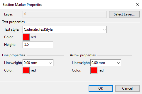
Section Marker Properties
You can define the following properties for section markers.
-
Layer – Click Select Layer to specify which layer in Layer configuration to use for section markers. Section markers can inherit their text color, line color, and lineweight from the layer, as described below.
Text properties
-
Text style – Text style defines the general visual appearance of the text. The default text style is "CadmaticTextStyle". You can select a different text style that has been defined in Drawing styles.
-
Color – Click the colored box to select the color to use for section marker texts. The first color in the color selector is the DWG color that is inherited from the layer.
-
Height – Specify the height of the text bounding box.
Line properties
-
Lineweight – Set the lineweight to be inherited from the layer or select a lineweight defined in Lineweights.
-
Color – Click the colored box to select the color to use for section marker lines. The first color in the color selector is the DWG color that is inherited from the layer.
Arrow properties
-
Lineweight – Set the lineweight to be inherited from the layer or select a lineweight defined in Lineweights.
-
Color – Click the colored box to select the color to use for section marker arrows. The first color in the color selector is the DWG color that is inherited from the layer.